


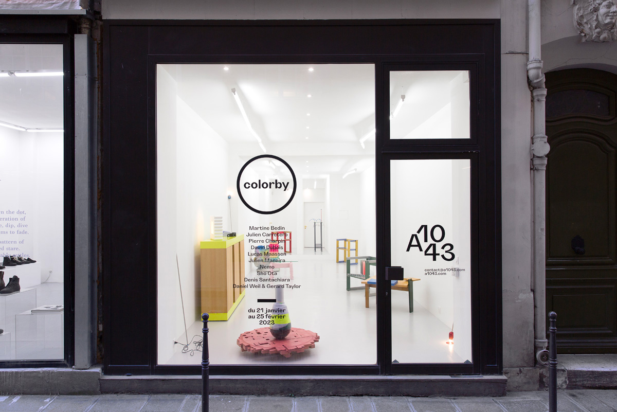
Colorby®
Martine Bedin, Julien Carretero, Pierre Charpin, David Dubois, Lucas Maassen, Julien Manaira, Nemo, Sho Ota, Denis Santachiara, Matteo Thun, Daniel Weil
January 21st
︎︎︎ February 25th, 2023
Say goodbye to exotic woods and other Scandinavian-American rigours, and say hello to colour, be it applied or natural. Forget black and get rid of regressive looped pile fabrics.
Teddy bears are a thing of the past. Listen to the fanfare. In these dark and grey times, a little colour will not do us any harm. Vitamin C and D on all levels.
Whether it is due to the times we are living in or the fashion for a return to the 80s, the fact remains that contemporary design has reclaimed colours that have not been seen for a
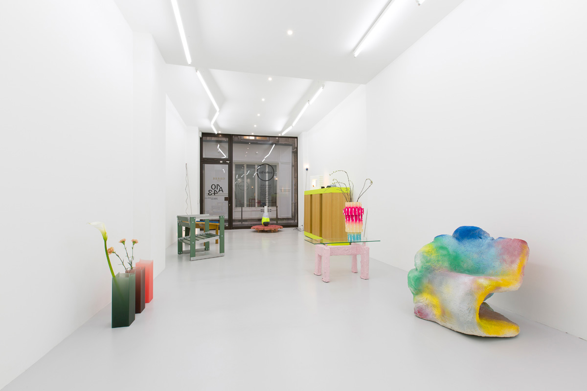
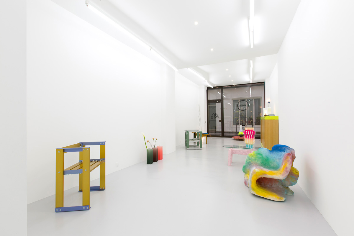
while. It may seem natural, but furniture and objects are not inevitably coloured. Colorby is a selection of objects and furniture in which colour plays a significant role. Colorby
combines contemporary productions with historic pieces to bring colour to your interiors.
Julien Carretero is best known for his Draag series. Vases, ceiling lights, wall lights - the whole series is highly colourful. Julien Carretero is an outstanding colourist. His work generally displays strong links with colour. The AL_AN series of chairs and armchairs, presented last October at the Zut! show, will be exhibited again at Colorby®.
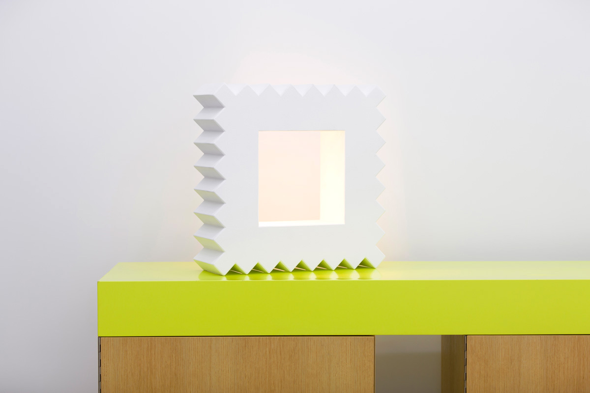
The link between Pierre Charpin and colour is more than obvious, even if the link is through drawing, but it is worth remembering that, from the start of his career, colour was already fundamental to Pierre Charpin. Bahut 3 modules is a unique piece of furniture. Produced in 2000 by the Kréo gallery, the colour here frames varnished wooden pedestals. It is almost a way of highlighting the wood.
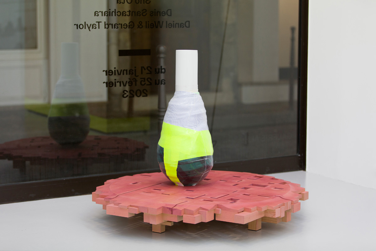
David Dubois produces very little. Every gesture counts and is precious to him. When David Dubois uses colour, it is not by chance. In the Protected Vases series, the largest is covered in a technical fabric usually used for sportswear.
With Lucas Maassen, anything is possible. And all colours are potentially usable. There are no taboos, taste or other guiding criteria. Colour is there to awaken. Lucas Maassen uses the colours available in the studio. Pink is the equivalent of sky blue, but it could have been red, it is all the same. There is no use of colour here linked to an idea or the desire to produce a particular effect other than being visually attractive. This detachment is nevertheless well calculated. By using a very wide and limitless chromatic range, Lucas Maassen achieves a freedom of use that is identical to the freedom needed to make the objects in the Vrijgieterij series in the exhibition.
Julien Manaira, on the other hand, uses colour with great subtlety. In the series of vases produced for Primavera1043, colour is not something insignificant. It does not cover
anything, it is the very material of the object, because the resin used is tinted in the mass. This coloured, luminous effect is the key to Julien Manaira's work, which goes beyond colour to focus on light.
Colour did not emerge immediately in Sho Ota's work. Although his body of work is still evolving, there is a set of reflexes and forms that are inherent in his work. Colour appeared
a little later than the recurring forms. Despite this, colour has assumed its place naturally. Using a very liquid water-based paint, the colour is applied without hiding the wood grain.
The final colour of the object is the combination of the colour of the wood and the paint used. The result is an incredibly soft, sophisticated object.